INTERNAL ERP REDESIGN

Role: UX/UI
- Led the redesign of the internal ERP, from flow analysis and UX audit to visual proposal and prototyping in Figma.
- Transformed complex logistics, warehouse, and billing processes into clearer, more intuitive interfaces, reducing cognitive load and errors in critical tasks.
- Defined a new information architecture and visual hierarchy, prioritizing key data and simplifying overloaded tables and headers.
- Validated prototypes with internal stakeholders, integrating feedback into agile iterations to ensure alignment with operational needs.
Company:
Bitbox SL (IKEA Islands)
Stakeholders:
Product Manager
Tools:
Figma, Skype
📍 Context and Trigger
Bitboxer’s ERP was the internal tool used by store employees to manage critical processes such as logistics, warehousing, transportation, and billing. However, its interface had accumulated years of patches: saturated information, weak visual hierarchy, and unclear flows, which led to frequent errors and slowed down key operations.
The need to modernize it became urgent: it was essential to align the experience with IKEA’s standards and ensure that daily store tasks could be resolved in a clearer, faster, and more efficient way.
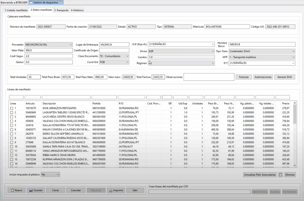
Bitboxer (before redesign)
🎯 Challenge
The challenge was to simplify a complex system without losing operational robustness. The interface needed to be redesigned to reduce friction, improve flow comprehension, and shorten the learning curve for new employees. At the same time, the project had to lay the groundwork for a scalable and coherent design, ensuring visual and functional consistency for future ERP modules while enabling the business to operate with greater security and efficiency.
🧪 The Process
The work began with meetings with stakeholders from each area, where they explained how the current screens worked and the flows associated with them. From these recorded sessions, I created a process map (logistics, warehouse, billing) that helped me identify friction points and interface gaps.
Based on this, I conducted a UX audit of the ERP, analyzing information density, visual hierarchy, inconsistent patterns, and overloaded tables. For each key issue, I researched best practices and benchmarks applied to complex data management and defined design criteria adapted to the operational context.
Next, I designed a new information architecture, reorganizing menus, blocks, and hierarchies so that critical information appeared at the right time and place. I translated the solutions into low-fidelity wireframes, which I reviewed with stakeholders through several iterations until achieving a clear and predictable structure.
Finally, I developed a visual redesign and component system, using the Rita design system, achieving cleaner headers, semantic groupings, well-defined states, and rationalized tables, ensuring coherence across modules.
To close, I built interactive prototypes in Figma, ensuring faithful implementation by the development team.

Before – After
✅ Outcome & Impact
The ERP redesign simplified critical processes in logistics, warehousing, and billing, reducing friction that previously slowed employees’ work. The new information architecture and clearer interface reduced frequent errors and shortened the learning curve for new users.
The resulting system solved immediate usability issues. Thanks to the defined components, the development team was able to implement faster and more consistently, improving collaboration between design and technology.
On a personal level, this project strengthened my expertise in UX audits for complex systems, information architecture, and strategic prototyping, reinforcing my ability to transform dense, critical tools into intuitive and efficient experiences.
👩🏻🏫 Key Learnings
This project strengthened my ability to design products within complex internal environments, where operational efficiency and flow clarity are critical.
Working on an ERP allowed me to deepen my focus on process optimization, prioritizing friction reduction and improved usability in high-frequency tools.
Ongoing collaboration with technical and business stakeholders was key to balancing real user needs, technical constraints, and implementation feasibility.
The project highlighted the importance of designing within existing systems, adapting to established architectures, and improving the user experience without compromising product stability.