"RITA" DESIGN SYSTEM

Role:
Product Designer / UX/UI Lead
- Led the project end-to-end, from the initial strategy to the final implementation, covering research, UX/UI, creation of the design system, and definition of the roadmap.
- Defined the strategic vision, operational framework, and technical execution, ensuring coherence and alignment across all project phases.
- Coordinated and guided a team of 2 UI designers, guaranteeing quality and consistency in every deliverable.
Company:
Bitbox SL (IKEA Islands)
Stakeholders:
Lead Developer, Product Managers, UX/UI Designers
Tools:
Figma, FigJam, Airtable, Storybook, Skype

On the left, the SKAPA Design System website; on the right, an example of a Mobile First e-commerce application (WTS), illustrating SKAPA’s original use focused on online commerce and mobile devices.
📍 Context and Trigger
SKAPA is the corporate design system currently used within IKEA’s global digital ecosystem.
At IKEA Islands, internal tools had made progress in design and usability, but they still faced a common problem:
- They were disconnected from each other.
- There was no visual or functional consistency due to the use of different technologies and frameworks.
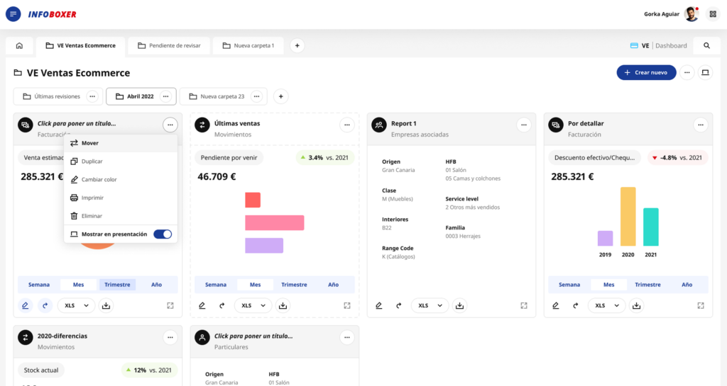
- SKAPA, the corporate design system, was oriented toward e-commerce and mobile-first, making it limited and ineffective for complex internal applications such as CRM, Bitboxer, Trackbox, Infoboxer VE, or Ventajón.
In my first project at IKEA (Ventajón), this lack of cohesion became evident:
- I needed components that did not exist in SKAPA or did not meet our needs.
- Each project used a different set of components, with no coherence or scalability.
- When I asked why there was no unified system, the answer was: “Each project has its own components,” and modifying SKAPA globally was not an option.
After several internal conversations and similar experiences from other colleagues, my manager offered me a challenge:
“Patricia, would you like to lead the adaptation and evolution of SKAPA for our internal tools?”

Internal platforms of Bitbox SL (IKEA Island), each with its own style guides and components, which led to visual and usability inconsistencies across projects.
⚠️ Scope & Constraints
Due to the confidential nature of the project, only selected examples are shown. The design system was implemented across internal tools and maintained within private environments and internal repositories, and therefore cannot be shared publicly.
🎯 Challenge & Need
Create a custom design system for IKEA Islands’ internal tools, using SKAPA as a foundation but redesigning and optimizing every element to meet the real needs of the internal workflow.
This involved:
Reviewing and updating the style guide.
Expanding the grid and spacing.
Improving component definition, functionality, and states.
Adapting tables and patterns to specific processes.
Documenting clearly to ensure ease of use and maintenance.
Such a system brings consistency and efficiency to new developments, reduces errors, shortens the learning curve, and eliminates technological or licensing dependencies, ensuring security and scalability.
🔎 Starting Point
RITA —in Swedish, “to draw, sketch, design, model”— We wanted something easy to pronounce, with its own identity, that conveyed creativity but also order and consistency.
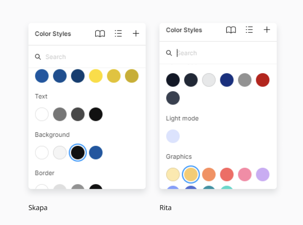
We conducted a joint inventory of what SKAPA already offered and what we, as designers, identified as essential in our projects.
In parallel, I interviewed other designers from the rest of the UX/UI team, developers and product managers to detect usability friction points, visual inconsistencies, and functional gaps.
Based on these conversations, we defined a plan: keep what worked, adapt what could be improved, and create from scratch what didn’t exist.
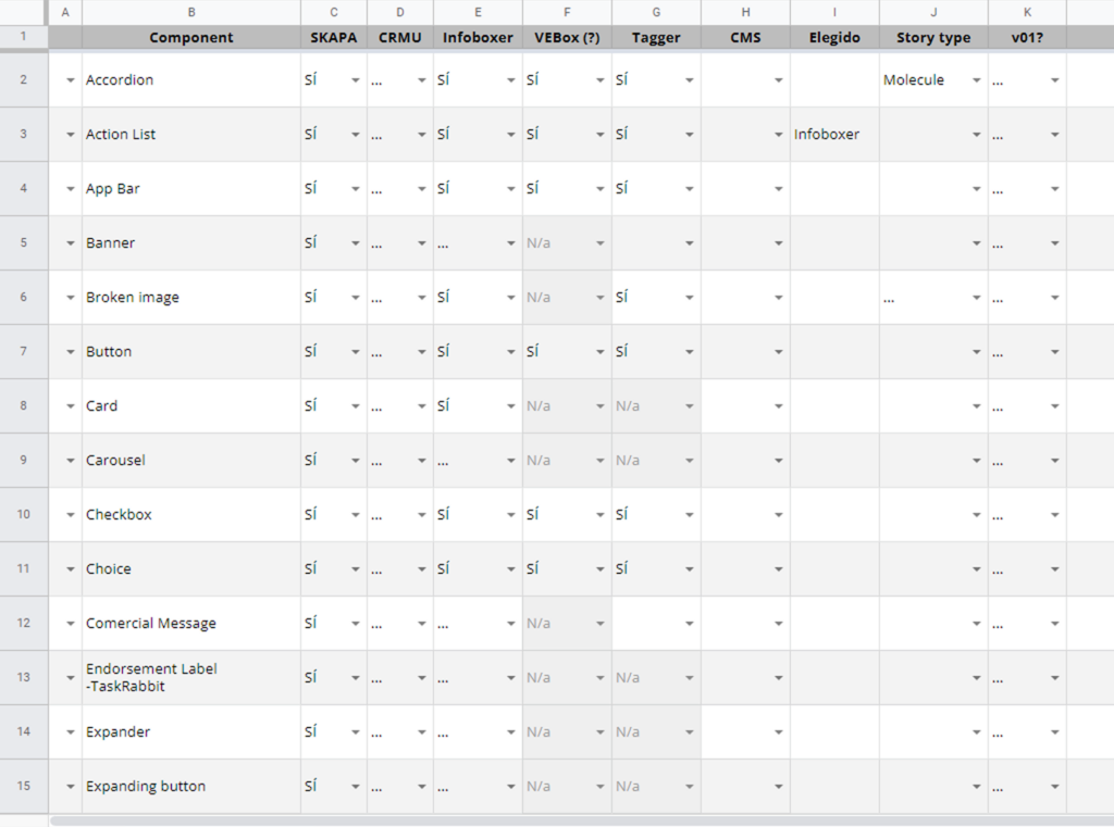
Inventory
🧪 The Process
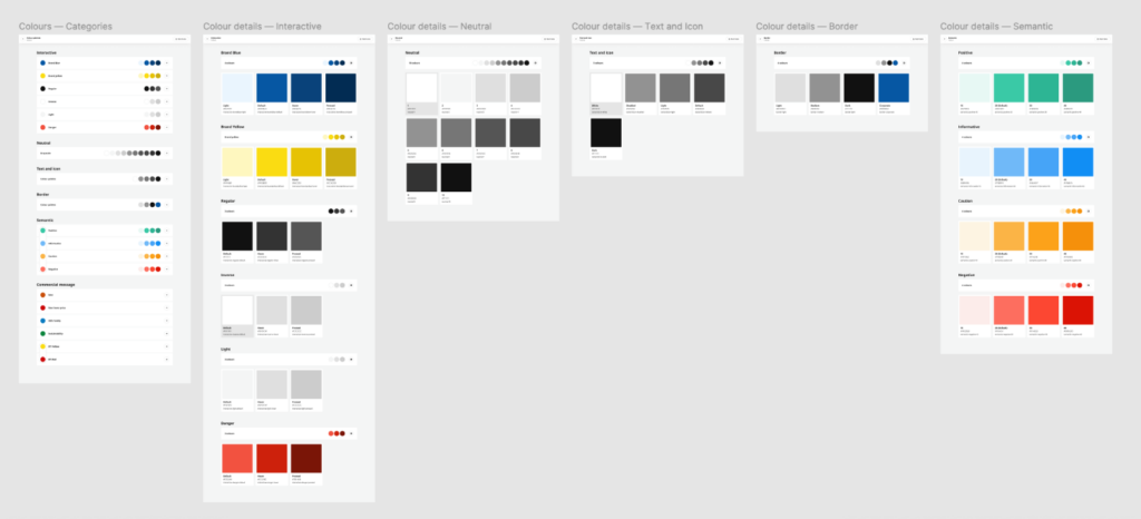
Style Guide
The style guide was not a static document, but rather a living backbone of the system. We began by establishing design tokens for typography, color, spacing, grid, borders, and shadows, ensuring they were scalable and adaptable to light/dark mode from the very start.
Every decision was documented with visual examples and use cases, so it wasn’t just a list of rules but an inspiring and applicable resource. We also integrated WCAG accessibility standards, defining minimum contrast ratios, font sizes, and spacing to improve readability and interaction—particularly for users with visual impairments.
Components
We worked iteratively. For each selected component, we defined its purpose, variants, states, and sizes before moving into design. One teammate would create the initial visual proposal, and then another designer and I would execute the component in Figma, including all variants and functional prototyping.
Every element was built using auto-layout, variants, and component properties to maximize flexibility and prevent duplication. At the same time, we ensured each component met accessibility standards: visible focus states, keyboard navigation, and clear error messages.
The library evolved into a coherent repository where every piece had a clear purpose and could be integrated without breaking the shared design language.
Documentation
The project generated several layers of documentation, each with a specific purpose:
- Design process: As a three-designer team, we kept a daily log noting what each of us had done, ongoing tasks, dependencies, and priorities. This allowed us to stay organized, quickly pick up where we left off after a break, and ensure nothing was overlooked. It served as our “narrative thread” for maintaining project continuity.
- Design team: I created visual guides for each component, displaying all states, sizes, and variants. The goal was for any team member to instantly understand how to use the component, eliminating confusion and reducing implementation errors.
- Development: I prepared technical specification sheets for each component, with examples of all states, sizes, and variants, as well as token definitions, padding and margin measurements in rem, and a description of expected behavior. In Airtable, I tracked the status of each component (in progress, reviewed, implemented), noting names, sizes, states, light/dark mode, and other versions. Each entry included direct links to the relevant Figma documentation so the development team could easily access it.
Handoff Flow
Handoff to development was not a one-off event but a continuous workflow. I worked closely with the lead developer to implement everything in Storybook, reviewing each delivery to ensure both visual and functional fidelity.
As components were completed, we organized internal workshops and added them to the asset library for immediate use in real projects.
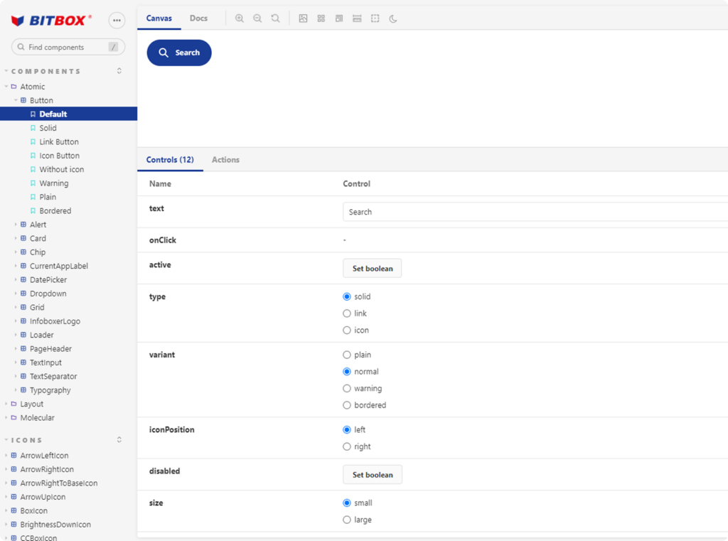
Storybook
🚀 Launch
When RITA reached a mature stage, we presented it to the international team.
The reception was very positive: for the first time, internal tools could share a unified visual and technical language without sacrificing flexibility. Teams began to adopt components in new developments, reduce design times, and minimize development errors.
🔧 Applied across internal tools
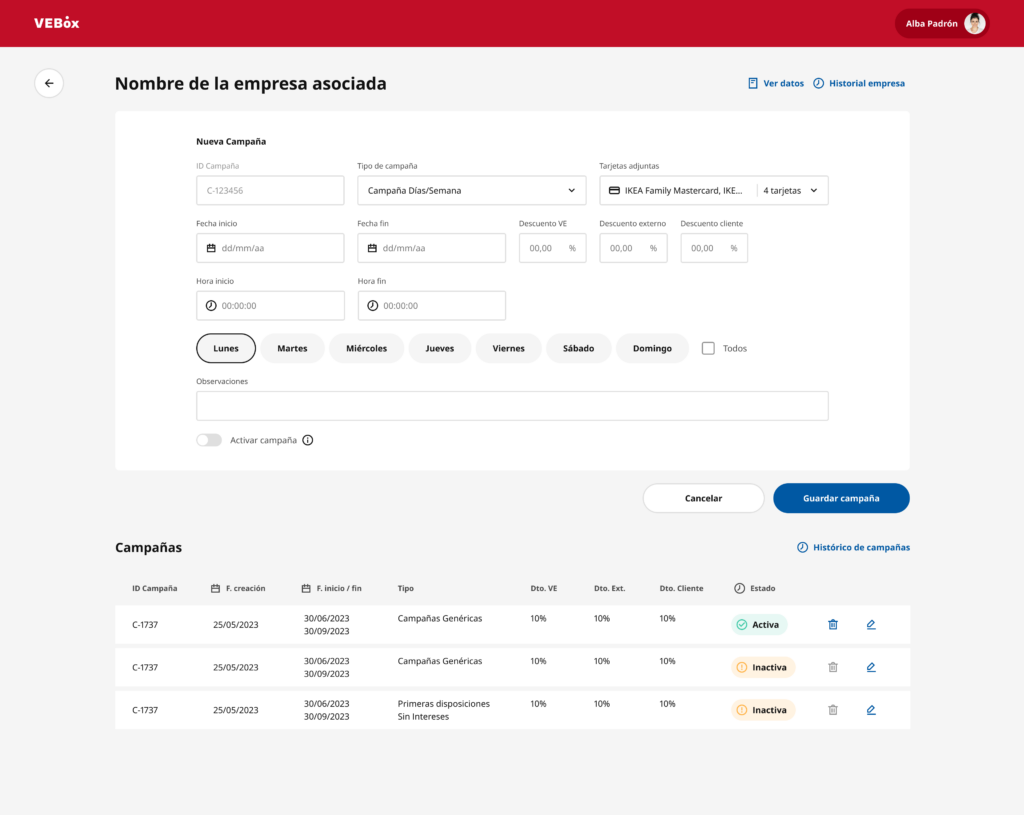
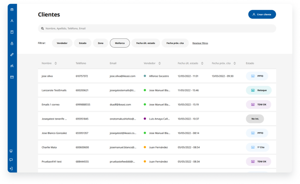
RITA was implemented as the foundation for multiple internal products, ensuring consistency and scalability across teams.
✅ Outcome & Impact
RITA became a flexible, scalable, and accessible design system adopted across 100% of internal products, replacing fragmented design approaches with a single, shared system.
This unification had a direct organizational impact:
Standardized UI patterns and components across all internal tools.
Eliminated inconsistencies between products developed by different teams.
Reduced implementation errors by establishing a single source of truth.
Improved alignment and collaboration between design and development.
Enabled scalable growth of internal products without increasing design complexity.
Rather than optimizing individual interfaces, the system transformed how internal products were designed, built, and scaled across the organization.
👩🏻🏫 Key Learnings
It enabled me to coordinate the UX/UI design team and align design decisions with real technical and organizational constraints, balancing visual consistency, usability, and technical feasibility.
The work required designing with long-term scalability and coherence in mind, as well as strategically documenting decisions to ensure system adoption, long-term sustainability, and smooth collaboration between design and development within a complex internal environment.