DIGITAL FINANCIAL COMMUNITY
Role:
Product Designer (UX/UI)
I actively participated in all phases of the Design Sprint, collaborating with the team to align user needs, product goals, and feasibility criteria.
My primary responsibility was translating a complex problem into a clear, testable experience proposal, covering the process from problem understanding to experience definition and prototyping.
Company:
Freelance · Product Discovery
Stakeholders:
Business, Product Managers, UX Lead & UX/UI Designers
Tools:
Figma, Fitjam, Zoom, Slack, Whimsical, Useberry
📍 Context and Trigger
Financial literacy remains a structural issue that directly impacts the quality of life of millions of people.
In Spain, 63% of the population report having basic or insufficient financial knowledge, while only 11% state they have advanced financial education. Among people over the age of 65, nearly 60% show an insufficient level of financial literacy.
The accelerated digitalization of financial services, combined with a lack of financial knowledge, further amplifies this gap—particularly among individuals with lower digital autonomy—significantly increasing the risk of poor financial decisions, fraud, and social exclusion.
🎯 Challenge & Need
The challenge was to explore a potential digital solution without a previously validated model, understanding the real needs of people with lower levels of financial knowledge, avoiding purely theoretical approaches, and reducing the risk of investing in the wrong direction.
🔎 Starting Point
A 5-day Design Sprint was used as the framework to explore the problem, align the team, and validate hypotheses quickly before committing development resources.
The objective was to determine whether a real product opportunity existed, identify the approach that delivered the most value, and discard key risks at an early stage.
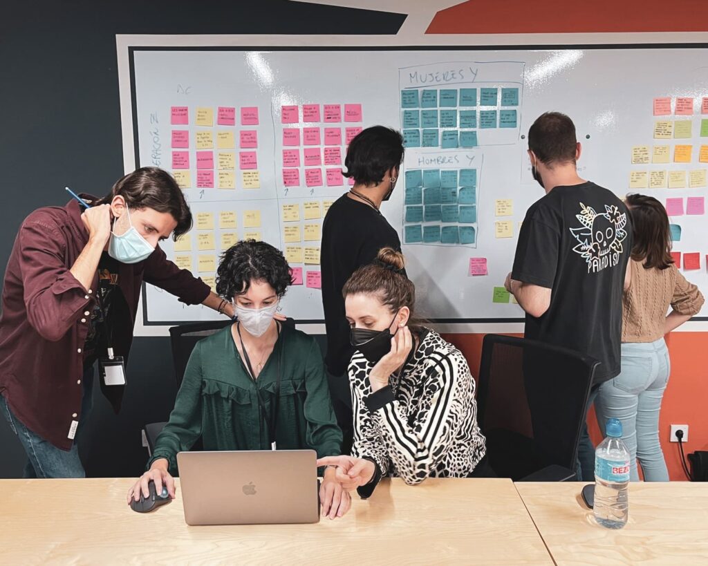
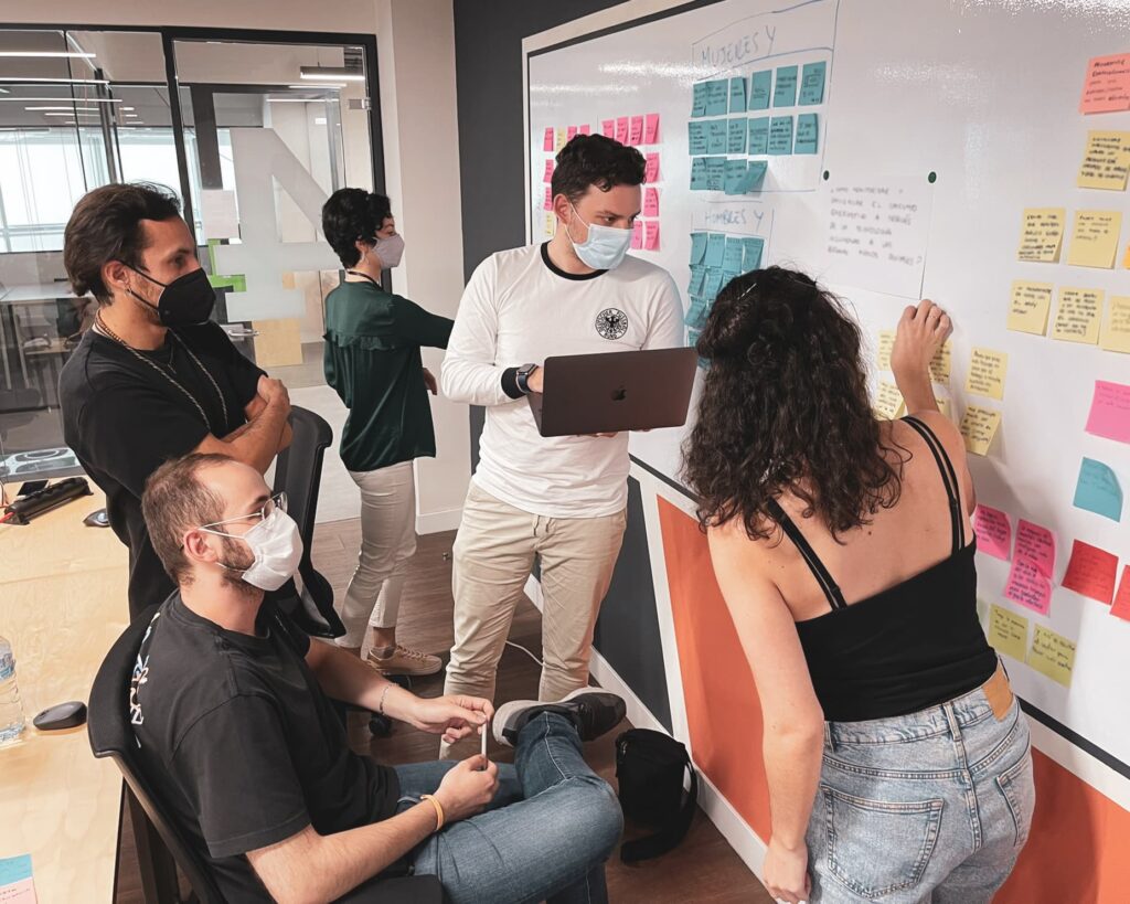
🧪 The Process
The work began with the definition of Sprint Questions, which helped align the team and clarify what needed to be validated within the limited timeframe.
Next, User Journey Maps were created for different user profiles, designed around real-life situations and considering variables such as age, life context, level of financial knowledge, and digital autonomy. This analysis made it possible to identify key friction points—such as technical language, fear of making mistakes, and lack of trust—as well as opportunities for intervention.
These learnings were translated into How Might We… statements, which served as the foundation for ideation. After a rapid solution exploration phase, a shared approach was prioritized through dot voting, focused on:
Creating a digital support community for financial learning.

This direction addressed a recurring need identified during the analysis: the lack of guidance and confidence throughout financial learning processes.
Building on this approach, the team explored different solutions in parallel and evaluated proposals visually and objectively, identifying the option with the strongest consensus:
A community inspired by collaborative models such as Slack, where learning happens through guidance and user-to-user interaction.

From this shared proposal, each team member developed their individual solution, maintaining the common direction while contributing their own perspective.
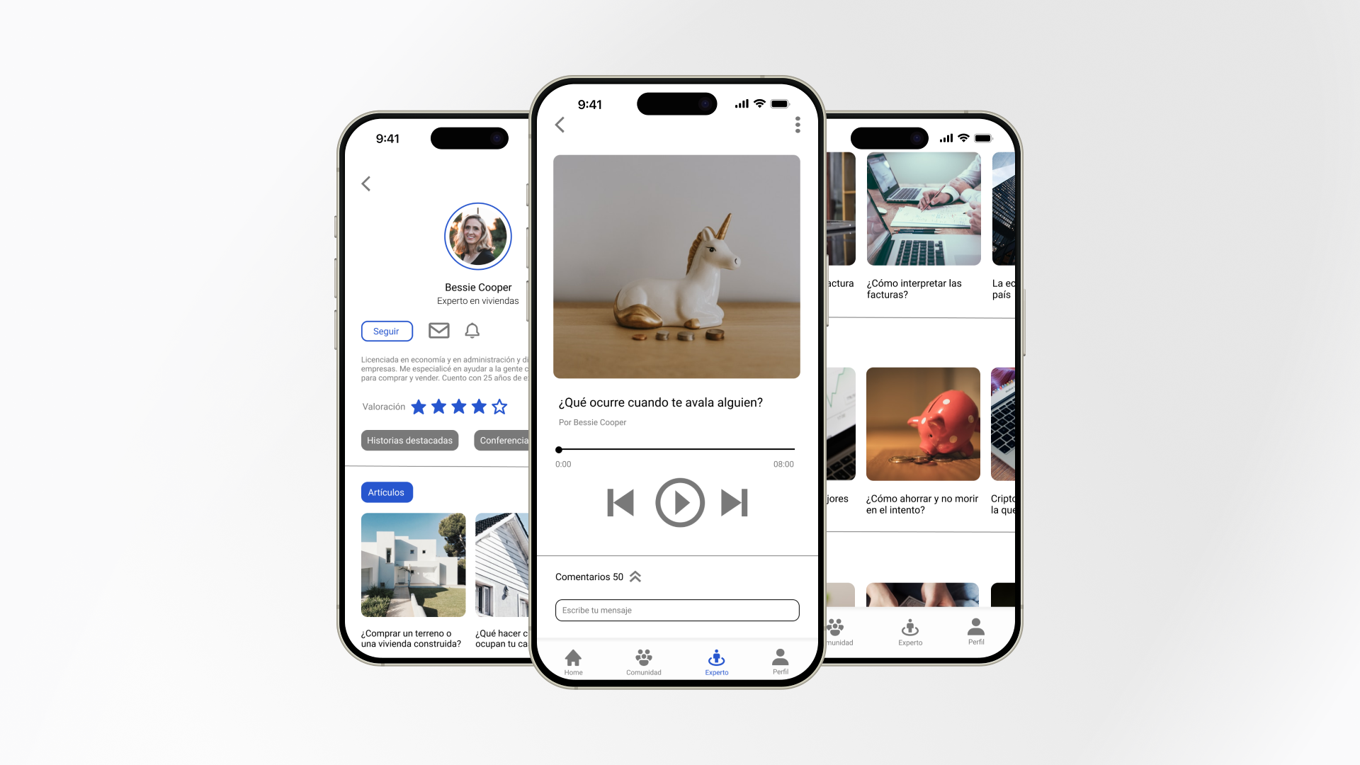
👩🏻💻 Individual Proposal
Building on the agreed direction, I developed my individual proposal to translate the concept into a clear functional and visual experience.
I designed an initial exploration of key screens in a mobile app format, aimed at people with low financial literacy and varying levels of digital autonomy, prioritizing:
- Accessibility and low friction.
- Clear, approachable language.
- A sense of guidance from the very first interaction.
- Community as the core learning driver.
The screens represent a conceptual exploration of the product, designed to validate the approach and overall experience rather than a final, development-ready interface.
🧩 Application Structure & Sections
Home
The Home screen acts as the first point of contact with the product.
Its role is to convey safety and clarity, avoiding any sense of financial complexity, while introducing the purpose of the community and providing access to the main areas of the application.
Community
This is the core of the product and the primary learning driver.
It is designed as a space where users can share questions, learn from real-life experiences, and feel supported when making financial decisions.
Content & Resources
Content is designed in a contextual way, linked to real-life situations (becoming independent, managing expenses, making basic decisions), and written in clear, accessible language.
The goal is to strengthen user autonomy without overwhelming them with information.
Access to reference profiles or experts is also considered as additional support within the learning process.
Profile & Progress
This section allows users to visualize their journey, access their activity, and reinforce a sense of progress and control over their financial learning.
📱 Initial Validation
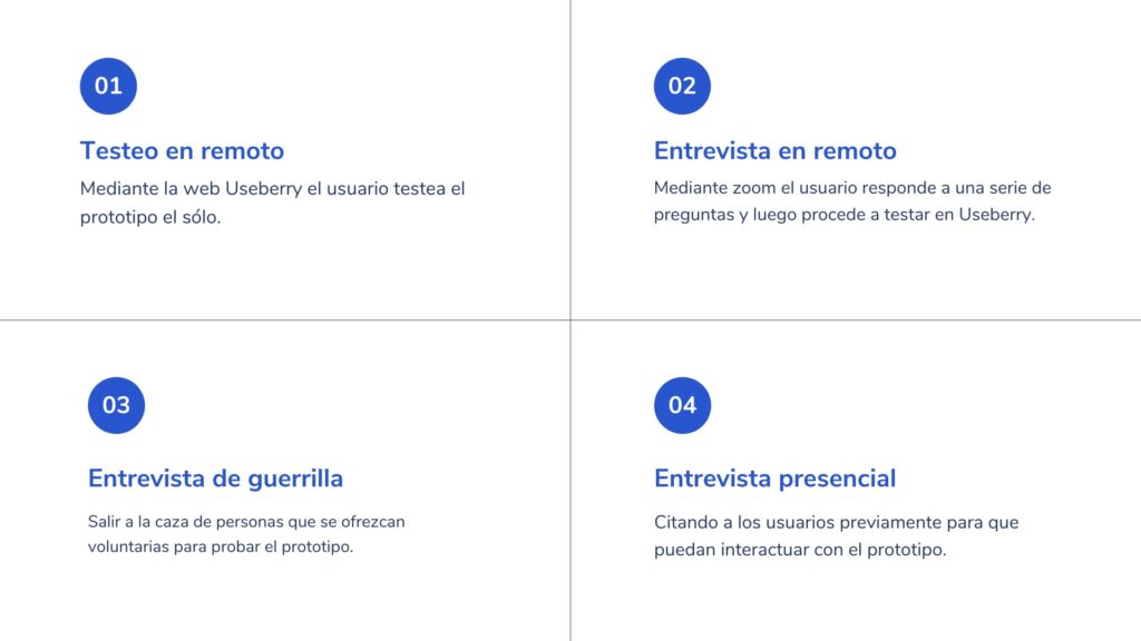
Exploratory testing was conducted with diverse user profiles in terms of age and level of financial knowledge, using both remote and in-person sessions. The goal was to evaluate concept understanding, navigation clarity, and perceived usefulness.
These tests helped identify improvements in hierarchy, language, and navigation, reinforcing the importance of simplifying the experience and reducing cognitive load for users with low financial literacy.
📈 Outcome & Impact
Once the Design Sprint was completed, the individual proposals and insights from exploratory testing were shared with the product stakeholders.
This work enabled a holistic evaluation of the initiative, considering not only the user experience, but also business viability, implementation complexity, and strategic alignment.
As a result, the decision was made not to move forward into a development phase. The solution was assessed as requiring a high level of effort and ongoing support relative to the expected impact at that time.
The sprint therefore delivered clear impact at a strategic level:
it reduced uncertainty, validated assumptions early, and prevented a larger investment without sufficient evidence.
👩🏻🏫 Key Learnings
This project consolidated my ability to work in early-stage product phases, where the primary challenge is not designing final interfaces, but reducing uncertainty and enabling informed decision-making within short timeframes.
The Design Sprint demonstrated the value of design as a strategic tool to:
Align multidisciplinary teams around a complex problem.
Prioritize hypotheses and approaches before investing in development.
Explore solutions in a fast, tangible, and testable way.
The experience highlighted that not every project needs to reach a development phase: validating a direction and deciding not to move forward is also a valuable outcome when supported by evidence and analysis.