APP USABILITY TEST
Role:
UX Researcher | Co - Create
As a UX Designer & Co-Creator, I co-led with a colleague the first official usability test at IKEA Island, from conception to results presentation.
Company:
Bitbox SL (IKEA Islands)
Stakeholders:
Business, Training, Product Managers, QA, Human Resources and UX/UI
Tools:
Figma, Fitjam, Useberry, Excel, Google Sheets & Docs, Drive, SurveyMonkey, and Skype
📍 Context and Trigger
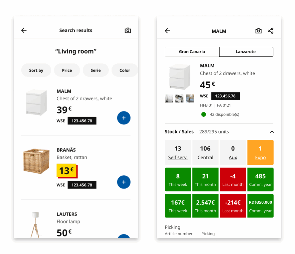
The Walk The Store (WTS) app is an internal mobile application used by employees to streamline the in-store shopping process for customers. They check stock, scan products, generate shopping lists, and carry out checkout processes.
The Business team wanted to introduce a new multi-card payment and financing feature, a significant extension of the payment flow that involved:
- Combining multiple payment methods.
- Activating financing under specific conditions for IKEA Family Mastercard and Ventajon cards.
Up until that point, formal usability tests had not been conducted at IKEA Island prior to developing new functionalities.
This led to:
- Redesigns after detecting issues in production.
- Wasted time and resources.
- Low adoption of certain functionalities.
- Strong reliance on training sessions to understand the tools employees were working with.
🎯 Challenge & Need
Validate the new multi-card payment and financing functionality before development, ensuring the flow was clear, fast, and free of ambiguities. The goal was to confirm that employees could understand the feature without prior training, that the texts, buttons, and visual hierarchies supported the task, and to detect possible friction points before implementation.
This approach allowed us to optimize before investing, reducing risks and avoiding costly design changes, while also improving the internal user experience with an intuitive and agile tool. It also set a precedent for incorporating usability practices into the UX team and ensured the solution was validated with real employees across different stores.
🔎 Starting Point
After several internal conversations about the need to validate features before development, we had repeatedly emphasized the importance of conducting usability tests to save both cost and time. When the multi-card payment and financing project arose, it was considered an ideal candidate to put this approach into practice.
In this context, my manager entrusted me with the responsibility of leading the first usability test, recognizing both my previous initiative in promoting this practice and my UX expertise. Later, a colleague joined to co-create the project.
Since this was the company’s very first usability test, we were starting from scratch, making it essential to build a solid structure that would guide the entire process.
Defining Scope and Objectives
The first step was to define the scope of the test: what we wanted to measure, how we would approach it, and with what resources. This included setting start and end dates, assigning responsibilities, defining the recruitment strategy in stores, as well as deciding on the team, tools, and software required. We also established clear objectives, KPIs, and both quantitative and qualitative metrics, which would give us a comprehensive view of the project’s success.
Choosing the Test Format
Another key aspect was deciding on the test format: whether it would be in-person or remote, moderated or unmoderated, and to what extent we would combine objective data (times, errors, success rates) with qualitative observations and participant feedback. At first, it was unclear whether everything would be done on-site or in a hybrid way, so we designed a flexible plan capable of adapting to either scenario.
Coordination with Other Teams
The logistics required coordination with Training, HR, Product Owners, and Business leads. Some strategic decisions—such as final dates or the definitive test format—depended on higher-level stakeholders, while our focus was on defining the type of test and the participation dynamics.
From Planning to Action
Thanks to this prior work of communication and coordination, we managed to clarify the how, when, with whom, and where of the tests. This starting point was essential to minimize unexpected issues during fieldwork and allowed us to establish a solid foundation before moving on to prototyping and execution.
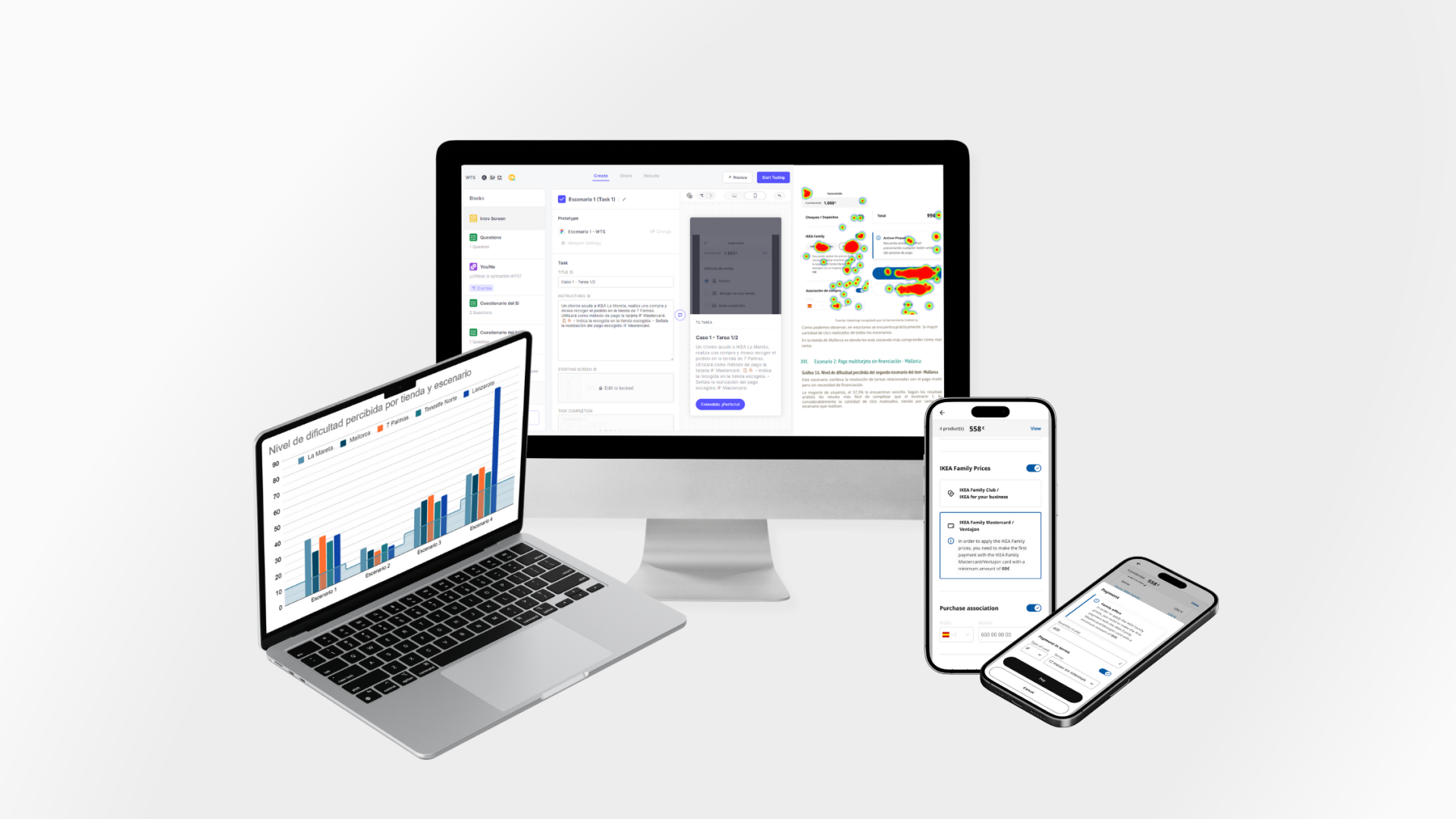
🧪 The Process
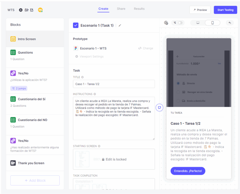
We started by working with the designer in charge of the WTS project, who provided us with the proposed flow screens.
Based on this:
- Defined 4 realistic usage scenarios, simulating tasks an employee would perform in their daily work with the new functionality.
- Built a clickable prototype in Figma to evaluate interactions, visual hierarchies, and text comprehension.
- Configured the test in Useberry, adding features such as heatmaps, screen recordings, and qualitative questions to collect direct feedback. Responses were automatically linked to Excel to streamline analysis.
- Established evaluation metrics: task time, success rate, errors, and perceived satisfaction.
Before going to the stores, we ran internal pilot tests with UX/UI team members simulating the role of store employees. The goal was to validate the prototype, identify quick adjustments, and ensure the flow worked well within the testing tool. With that feedback, we refined texts and navigation.
I collaborated closely with Human Resources, sharing progress and process details to ensure that administrative tasks, travel permits, and cross-department coordination ran smoothly. This interaction facilitated logistics and guaranteed that all stakeholders had visibility into the progress and requirements of the test.
📱 Test Execution
I coordinated with the Training team, who provided detailed lists with employee names, roles, and availability. This allowed us to select the most convenient days and times to gather a representative sample.
They also offered an access link to Useberry through the training platform, so employees could easily join the test from their usual work devices (mobile and/or computer).
We selected experienced WTS app users who had sufficient knowledge to complete the test successfully and who had previously received training in other functionalities required to evaluate the new features.
The real testing phase was organized as follows:
Gran Canaria (2 stores) – In-person test (conducted by me).
Tenerife (1 store) – In-person test (conducted by me).
Mallorca (1 store) – In-person test (conducted by my colleague).
Lanzarote (1 store) – Remote test, coordinated through the Training team.
During the preparation and execution phase, I worked with the QA team, who provided the corporate mobile devices needed for the tests. I was directly responsible for coordinating with them, receiving the devices, and accessing the internal employee platform where the test link was hosted.
Originally, employees were expected to use their own company phones or computers. However, once in-store, issues arose: some devices did not have access to the platform. This made the QA device—initially the backup plan—become the main solution, ensuring all employees could complete the test.
To guarantee that anonymous records were correctly logged in Useberry, I coordinated in real-time with my colleague in Mallorca: while I conducted the test in Gran Canaria, she monitored that responses were arriving in the platform without errors.
In-store, I was always accompanied by the Training team. I took care of on-site moderation, closely observing interactions, noting friction points, and only resolving minimal doubts to avoid biasing results. For Lanzarote, data collection was carried out remotely through direct links under Training team supervision.
Thanks to this hybrid setup and constant coordination between teams, we ensured the reliability of results and obtained a representative, realistic view of how the new functionality would be used across different store contexts.

Tests in stores: Gran Canaria and Tenerife. Supported by the Training team and a colleague in Tenerife.
📊 Results Analysis
After running the test, we collected all responses and began the data analysis.
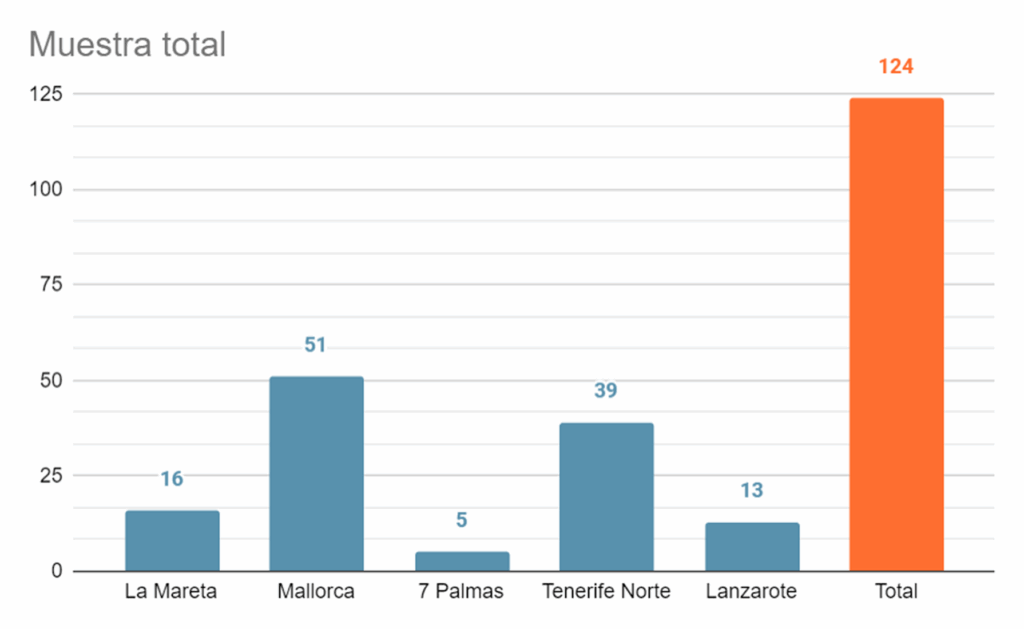
The final sample consisted of 124 employees.
Efficiency
Percentage of user efficiency when completing specific tasks, considering the number of clicks performed.
(optimal total clicks / total clicks sum) * 100
Success Rate
Percentage of users who completed the test without dropping out.
(users who completed the task / total sample) * 100
Error Rate
Percentage of errors made by users when completing specific tasks, considering unnecessary clicks.
100 – (efficiency rate)
Satisfaction
Measured through surveys or questionnaires after the usability test, where users expressed their level of satisfaction with the experience.
What users say vs. what they actually do
Although in the general perception question store employees rated the tool as “simple” (most scored between 4 and 5) on a 5-point Likert scale, where 1 is ‘very complex’ and 5 is ‘very simple’, this feeling did not fully match the reality observed during testing.
To reinforce this contrast, the Excel export with all UseBerry data allowed us to analyze times, clicks, and errors objectively. Thanks to this quantitative information, we confirmed that beyond what users expressed, there were confusing steps that slowed down the experience.
- Scenario 1: Full payment with financing
- Scenario 2: Multi-card payment without financing
- Scenario 3: Usual multi-card + financed payment
- Scenario 4: Multi-card payment with financing + voucher
The easiest scenario was 2, followed by very similar levels of difficulty in scenarios 3 and 1. Scenario 4 appeared with a much higher average due to an isolated case in Lanzarote (a remote test with more than 700 clicks in a single task). If we exclude this outlier, scenario 4 is at a comparable difficulty level to 1 and 3.
In other words, the employees’ initial perception did not reflect the actual friction points they experienced when interacting.

Collected in Useberry: contrast between open qualitative responses and objective test execution data (times, clicks, and results by store/scenario).
🧨Usability Testing Issues
The usability test allowed us to move from perceptions to objective data. Although employees rated the tool as “simple,” interactions revealed critical comprehension issues, unclear flows, and confusing error messages. These problems were grouped into different scenarios that reflected the main real usage difficulties.
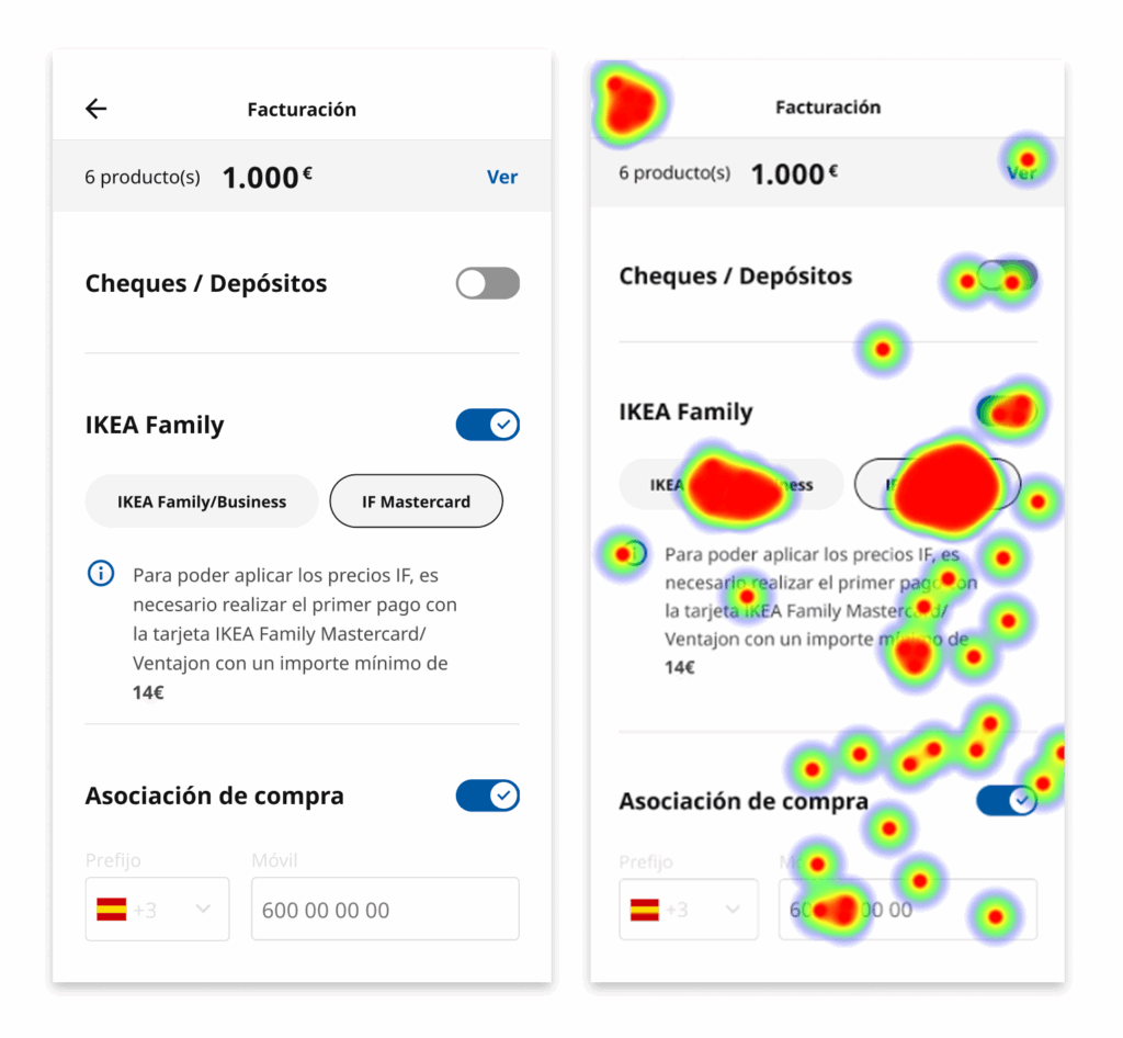
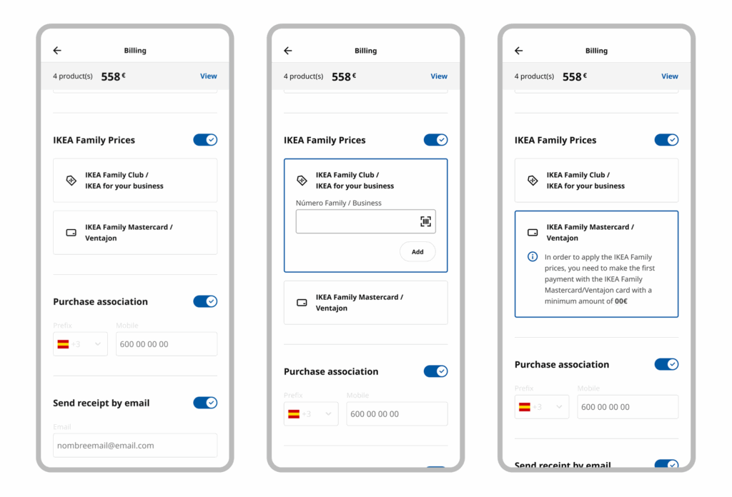
IKEA Family
- Card confusion: employees did not understand the relationship between IKEA Family/Business, IF Mastercard, and the Ventajon card.
- Insufficient visibility: Ventajon did not appear at the same level as IKEA Family, raising doubts about whether it applied to discounts.
- Unclear language: the naming of the cards and lack of explanation created insecurity when making a selection.
- Lack of contextual help: there were no clarifying messages in the flow to resolve doubts at the moment.
- Verbatim:
- “The IKEA Family and Ventajon cards should be differentiated.”
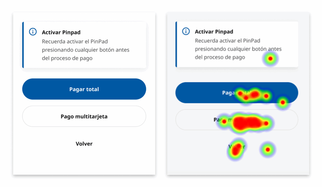
Pay Total vs Multicard Payment
This was one of the most difficult points and where the most issues were observed.
- Users were accustomed to the Bitboxer experience, which felt more intuitive to them.
- They interpreted the “Pay Total” option as immediate charge without financing, when in reality it included both possibilities.
- Verbatims:
- “The button text is not clear, it looks like it will charge me everything instantly. It’s confusing.”
- “Instead of ‘Full Payment,’ the button should say ‘Single card payment,’ since the other says ‘multiple cards.’”
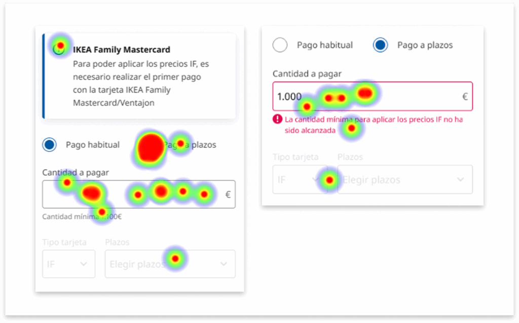
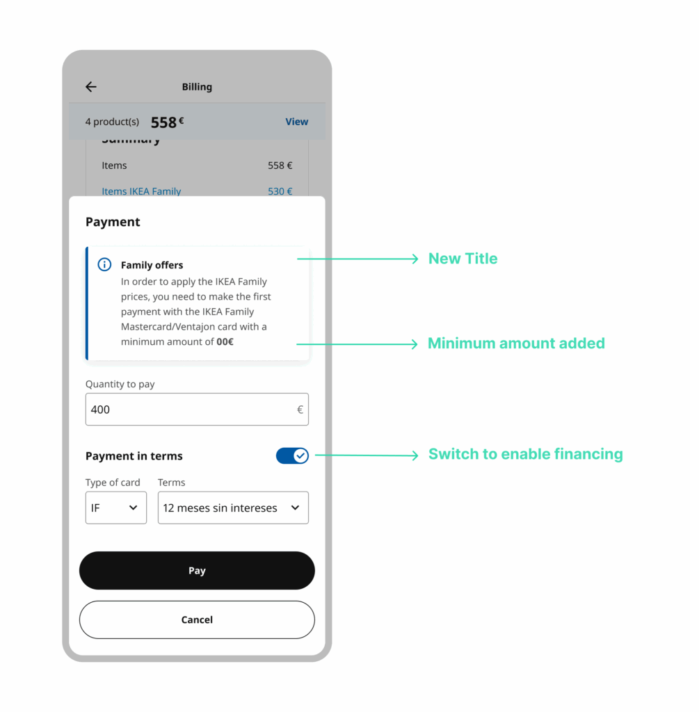
Payment in terms and minimum amount
- Premature errors: the system showed amount error messages before the user defined installments.
- Excessive scrolling: installment information and summaries were hidden, fragmenting the experience.
- Unclear copy: texts mentioned only the IKEA Family Mastercard, without including Ventajon, giving the impression it did not apply.
- Exclusionary modal: minimum conditions seemed exclusive to IF, relegating Ventajon to the background.
- Verbatim:
- “The amount error for installment payments shouldn’t appear until after defining the number of installments, since that’s the limiting factor.”
🎨 Proposed Redesign
Following the usability tests, a redesign was proposed to simplify the experience, reduce errors, and improve the understanding of the payment flow. The goal was to align the system with the real logic of in-store employees, avoiding confusions that led to cognitive overload and the need for extra training.
The strategy was based on the data–insight–action matrix, prioritizing changes on three fronts:
- Clarity in language and visual hierarchy.
- Restructuring flows to integrate them progressively.
- Useful feedback and validations at the right moment.
IKEA Family Prices
- Group all cards linked to IKEA Family in a single block, clearly indicating that Ventajon also applies.
- Clear visual differentiation between cards: icons + colors + explanatory text.
- Add a clarifying tooltip under the selector to directly explain equivalences.
One Card Payment - Multicard Payment
- Change labels to use clearer and more natural language for collaborators:
- “One card payment” instead of “Pay Total.”
- Adjust the flow so that error messages related to financing appear only after defining installments, avoiding confusion.
Payment in terms and Minimum amount
- Introduce “Payment in terms” as a sub-option within the flow, so it is perceived as a natural part and not a parallel process.
- Add a visual summary of installments and terms on screen, reducing scrolling and improving comprehension.
- Reorder validations so they only appear once the user has defined installments.
- Introduce a tooltip with the title “Minimum amount IF”, also specifying its equivalent in Ventajon.
- The tooltip also includes the equivalent reference for Ventajon, preventing it from being perceived as an IF-only requirement.
- The minimum amount appears in context, at the same point where payment decisions are made, not only in a generic modal.
- Adjust copy so it is clear that financing is naturally integrated into the regular payment flow.
🚀 Launch
During the launch, 3 key meetings were held with national and international teams, where progress, learnings, and perspectives were shared.
These sessions helped align objectives, identify new opportunities for improvement, and gather best practices that can be applied to future projects.
The exchange of experiences with different teams provided cultural and methodological richness, strengthening the product’s global vision and generating a more solid framework for upcoming challenges.
✅ Outcome & Impact
Product
Usability testing made it possible to identify critical comprehension issues before launch, preventing checkout errors and reducing costs associated with rework and post-launch training.
Redesign decisions were based on real usage data rather than assumptions.
Organization
This was the first usability test ever conducted within the company. Its success established user research as a core part of the design process, setting a new internal standard for future projects.
Internal Teams
The process aligned design, business, and technology teams, replacing subjective opinions with objective evidence and enabling shared decision-making.
End Users (Store Employees)
Direct participation in testing increased trust in the tool and supported adoption, reducing friction and training needs.
👩🏻🏫 Key Learnings
This project consolidated a way of working grounded in structured research, traceability, and informed decision-making, particularly relevant in contexts where product errors have a direct operational impact.
I deepened my use of documentation as a strategic tool, adapting the level of detail and format to the type of project and the needs of different stakeholders.
I strengthened my ability to synthesize large volumes of information (observations, qualitative data, and testing results) into clear, actionable insights.
I worked with an iterative analysis approach, integrating continuous feedback and successive validations to refine the solution without losing design coherence.
I improved how results are communicated to stakeholders, translating research findings into clear implications for business, design, and decision-making.
I consolidated a risk-reduction–oriented methodology, prioritizing evidence over assumptions before scaling.
The project reinforced the idea that the value of design lies not only in the final interface, but in the ability to structure, validate, and clearly communicate complex decisions in a measurable way.